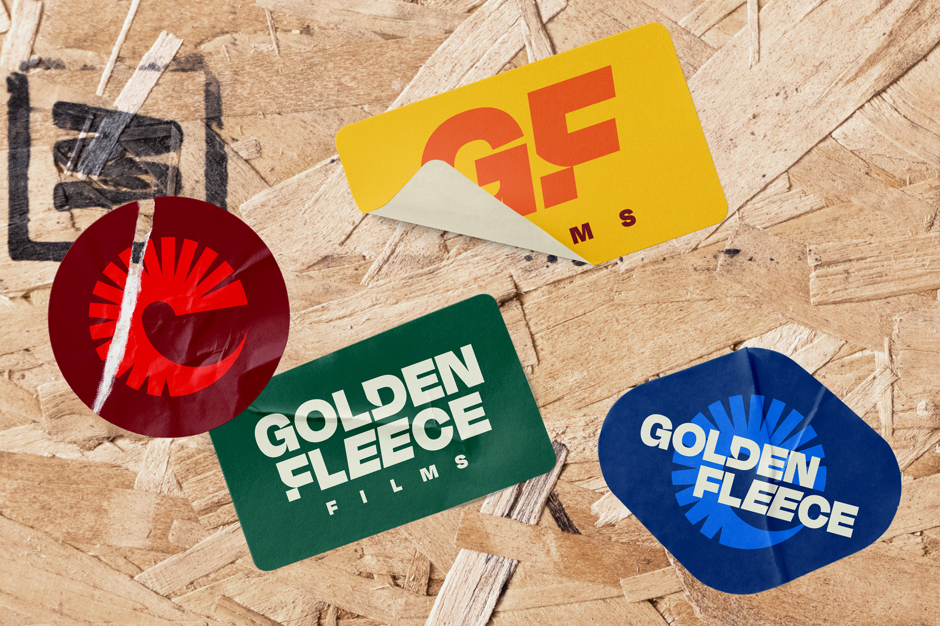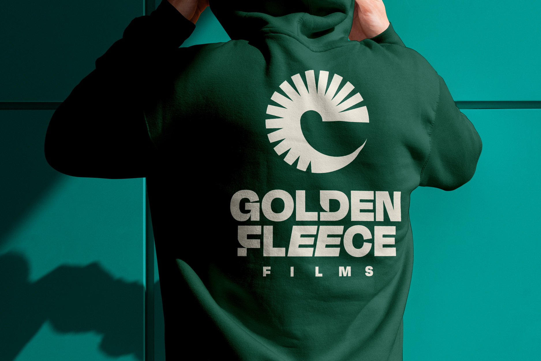
The old mark was pulled from a generic design platform. Clipart, basically. It said nothing about who they were or the audience they wanted to reach.
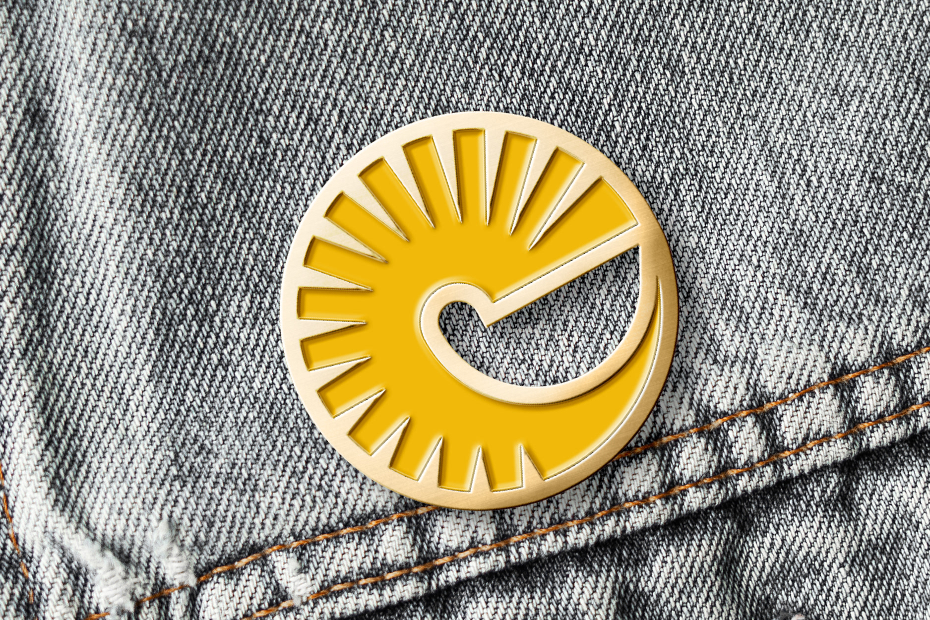
The idea sits in the symbol. It started with the ram's horn, a nod to the pub where the company was founded. From there, it became something with a second life. Look again, and the horn reads as a buffering icon, the little circular loader you see on every video. So the mark holds two meanings at once: where they came from, and what they do now.
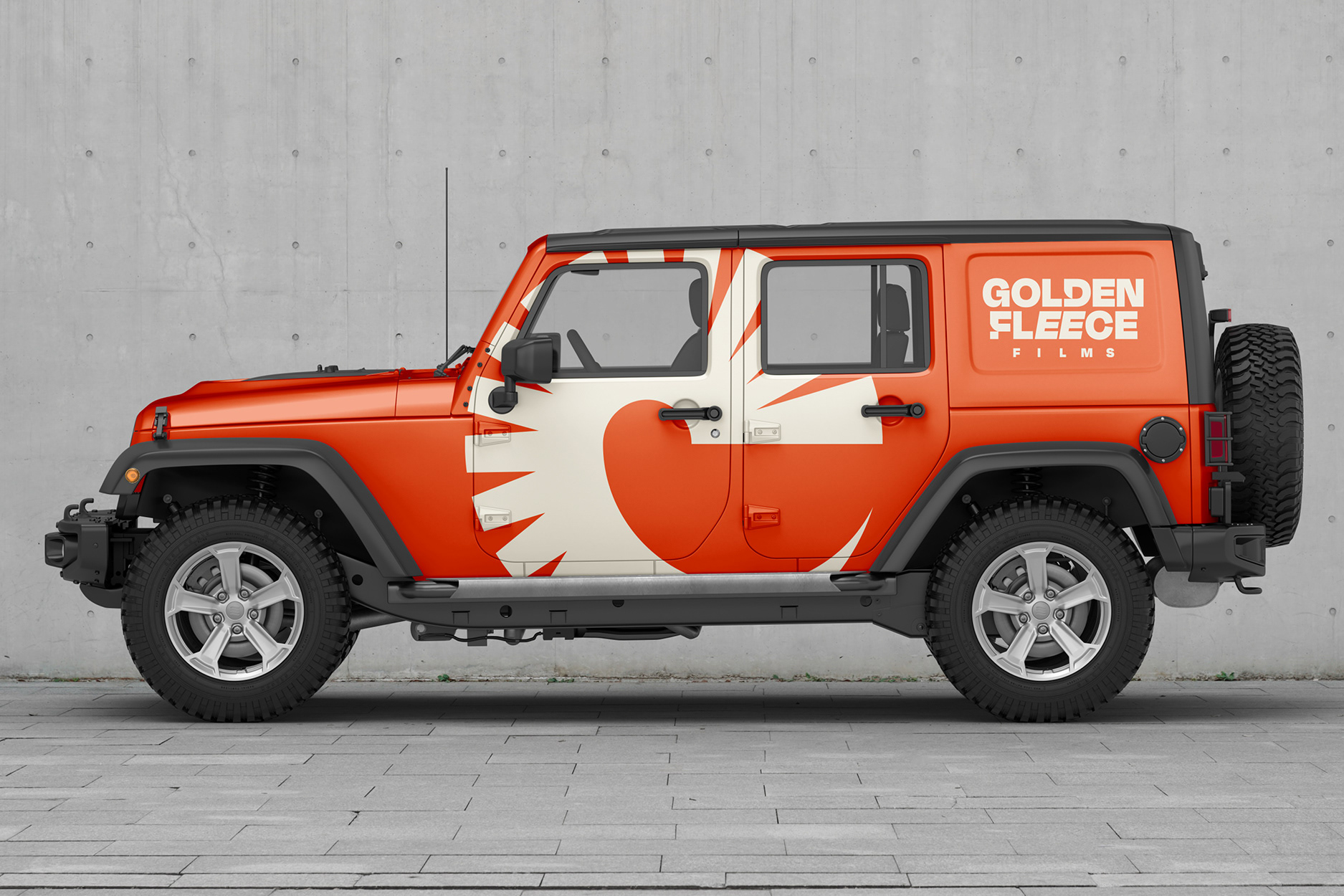
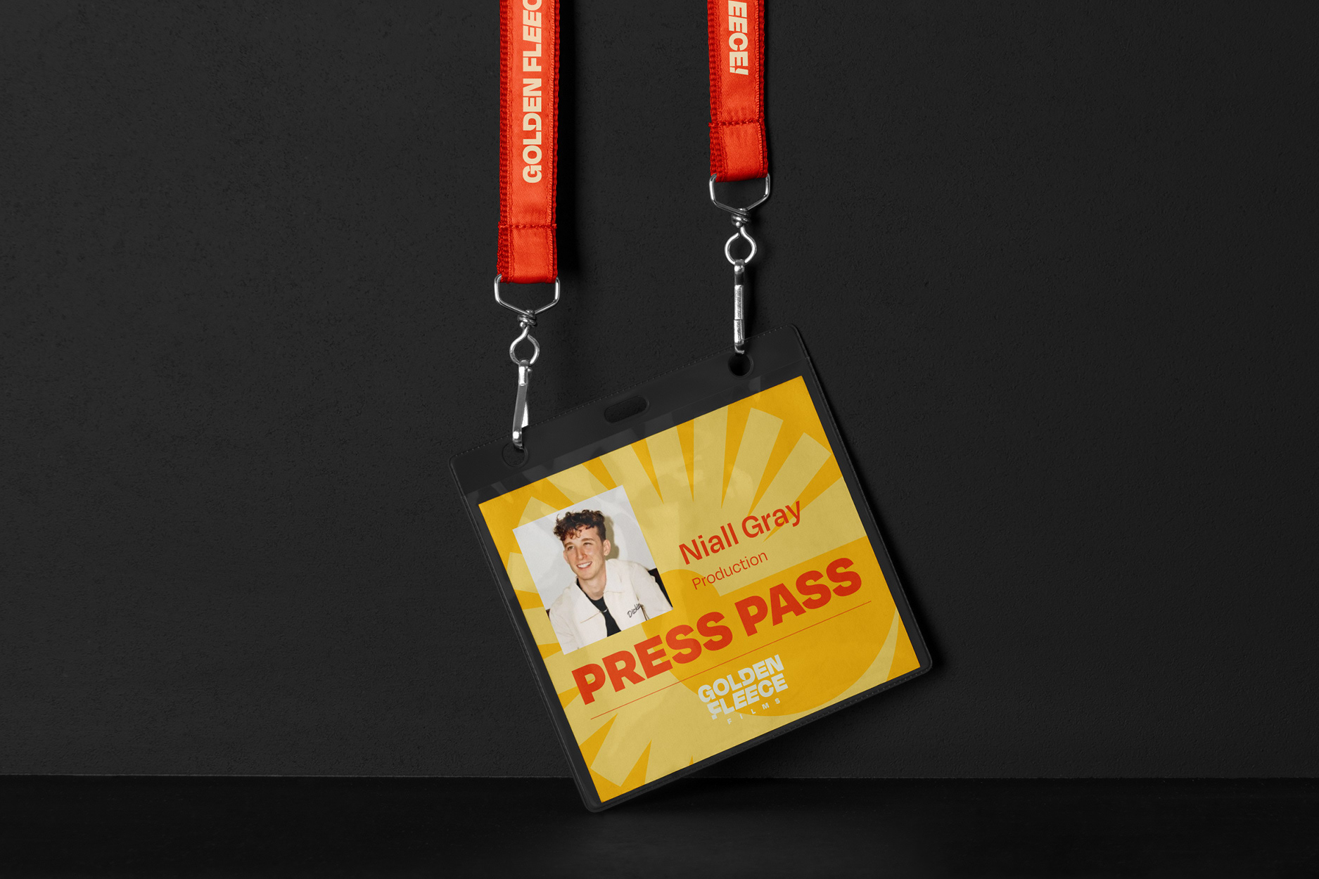
Around the symbol, I built a system that can move. The wordmark is heavy and confident, set in a way that feels closer to broadcast than corporate. The colour palette flexes across green, orange, red, blue, and yellow, so the brand can shift tone across a hoodie, a vehicle wrap, an enamel pin or a press pass without ever losing itself.
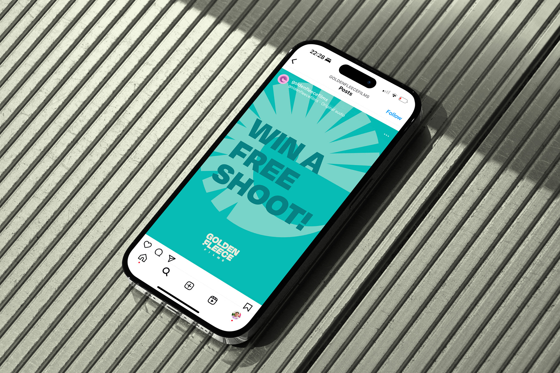
The result is a brand that looks the part when Golden Fleece pitch for bigger work. It reflects the way they actually operate, and gives them something they're happy to put on their backs and their cars. That last bit matters more than it sounds (click the button...).