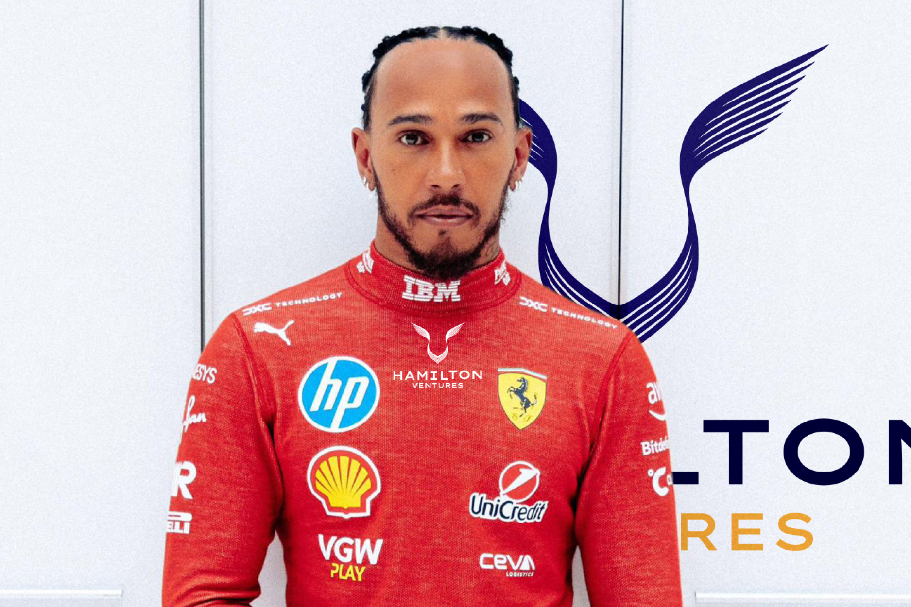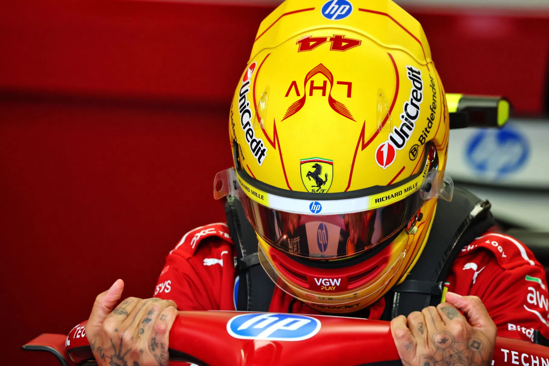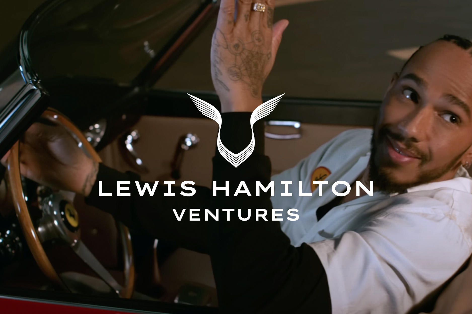
I led the design at Freuds Communications. The brief was to build a brand around Hamilton's existing panther mark, the symbol he already used. The job wasn't to replace it. It was to give it a world to live in.
The mark is a panther, though people often read it as a pair of wings, and that double read is part of its appeal. Either way it suggests speed and lift, which is the point. I built the identity to make the most of it.
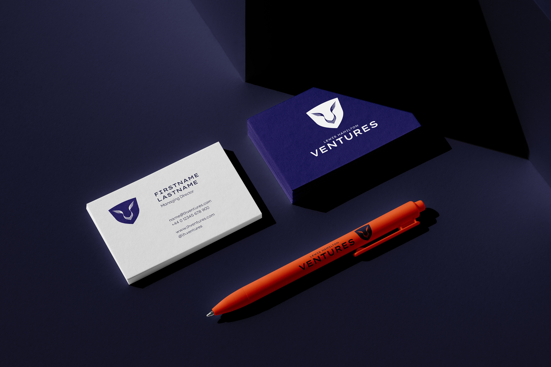
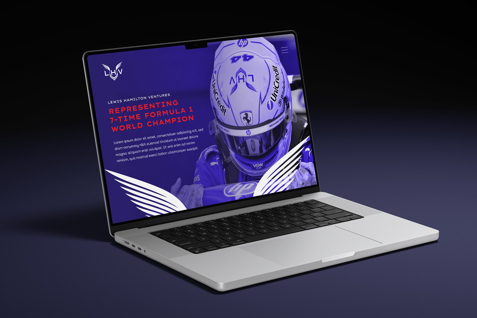
That meant working through the options properly. Different typefaces, different colour palettes, different ways of using the mark, including setting it inside a shield to give it a contained, crest-like form for smaller and more formal applications. The aim was a brand with range: confident enough for a launch, flexible enough to sit across a business card, a race suit, a helmet and everything in between.
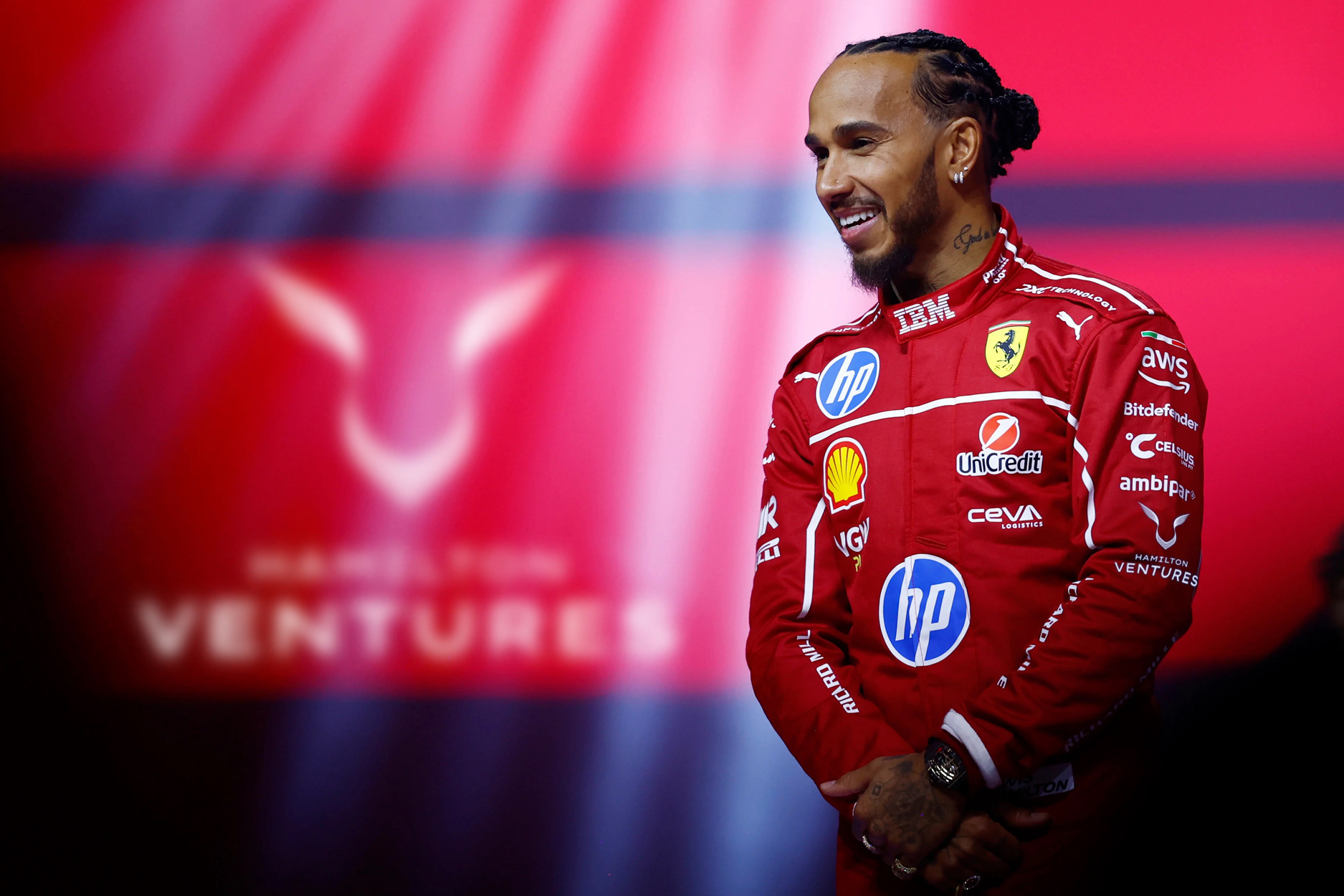
I designed all of this as a set of mockups to present the idea. Once it was signed off, the brand went into production with the Freuds design team, and what was built stayed close to the identity I'd created, with only minor changes along the way.