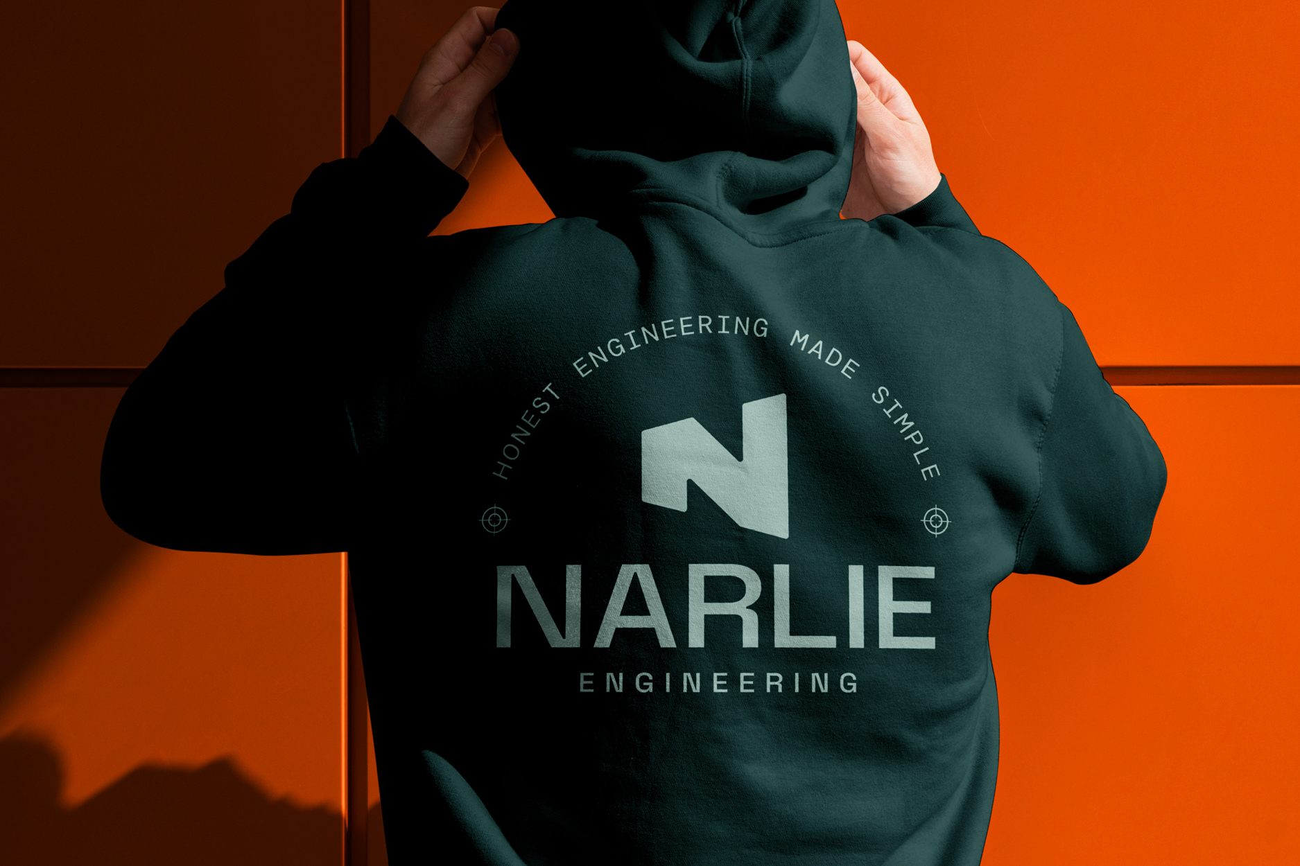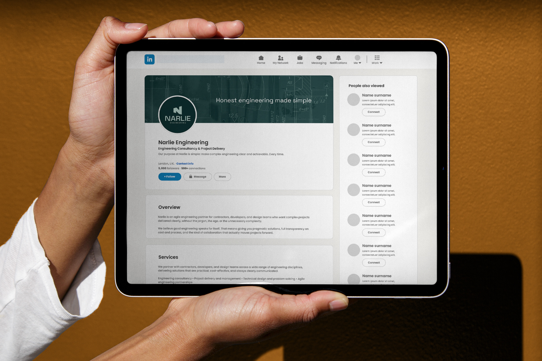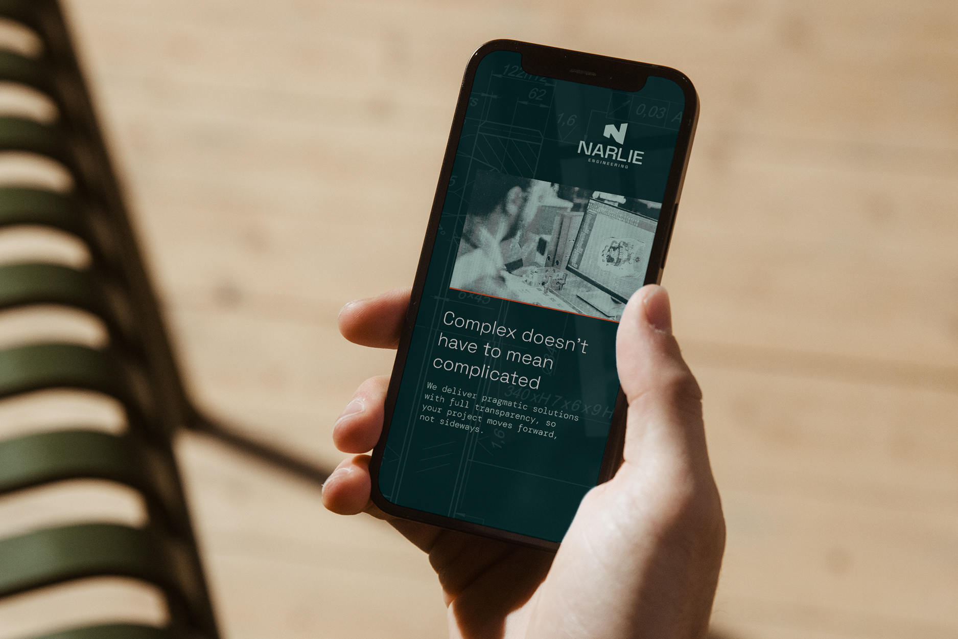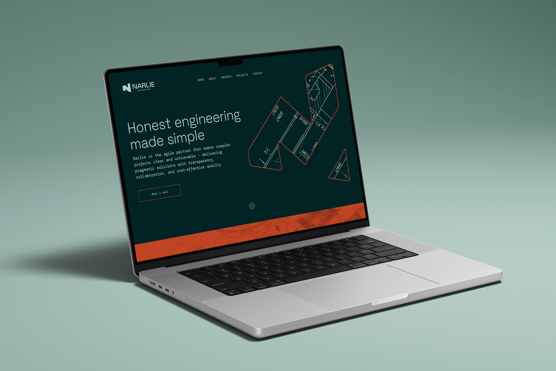
The brief was clarity. A new engineering firm in a field full of slow, opaque, corporate-sounding competitors, wanting to stand out by being the straightforward one. So the brand couldn't be loud. It had to feel calm, precise and confident, the way the best engineer in the room behaves.
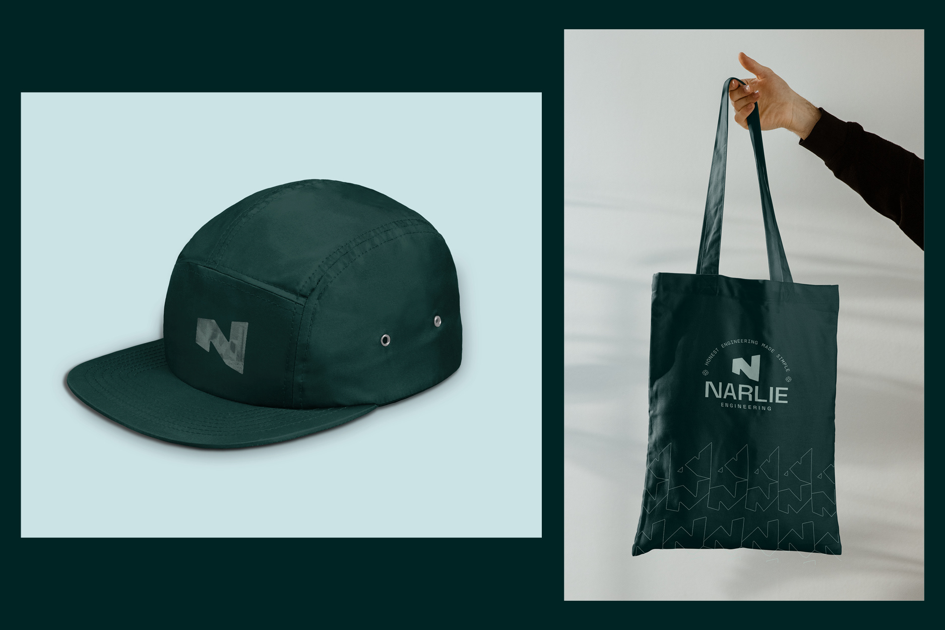
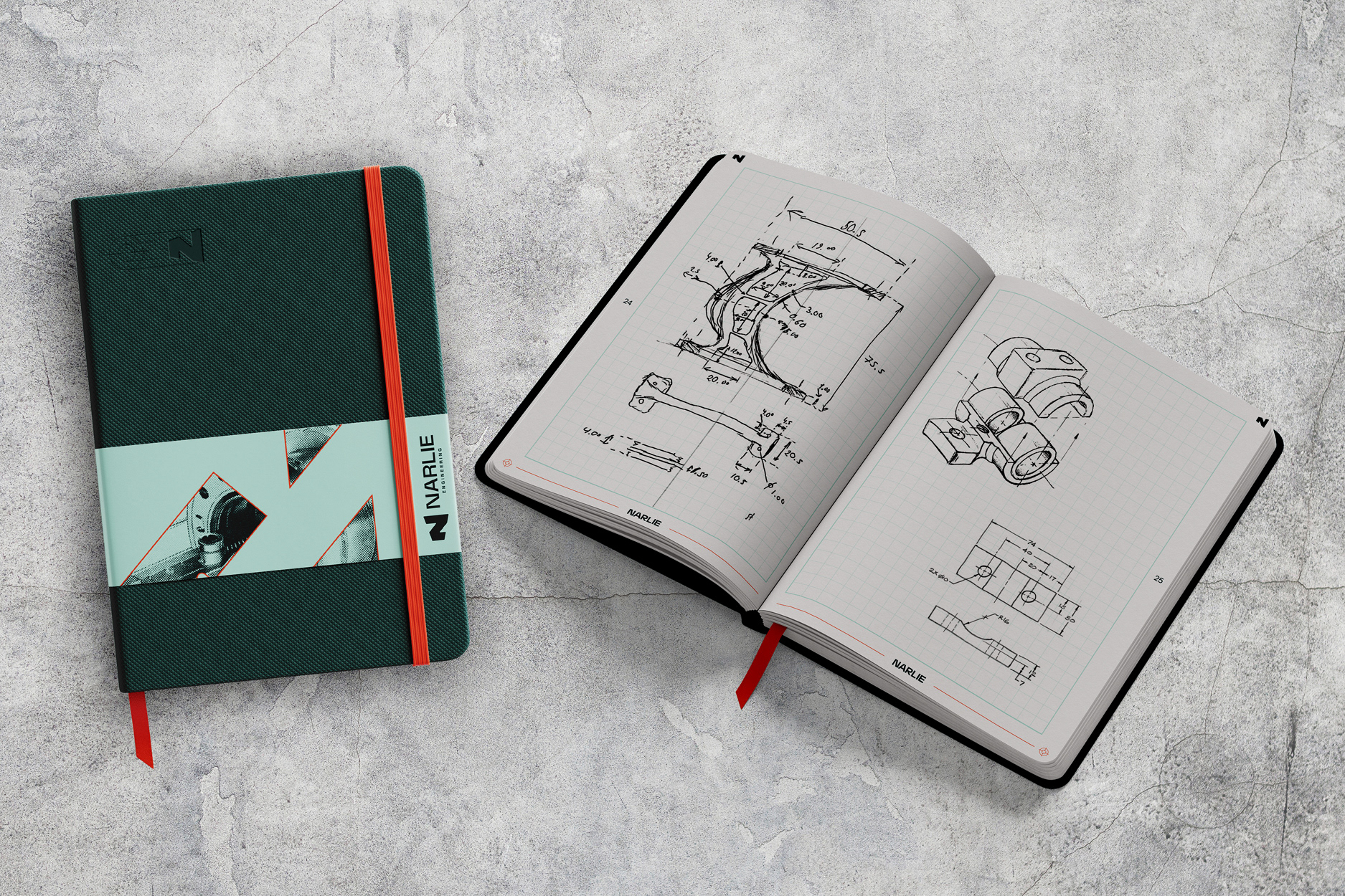
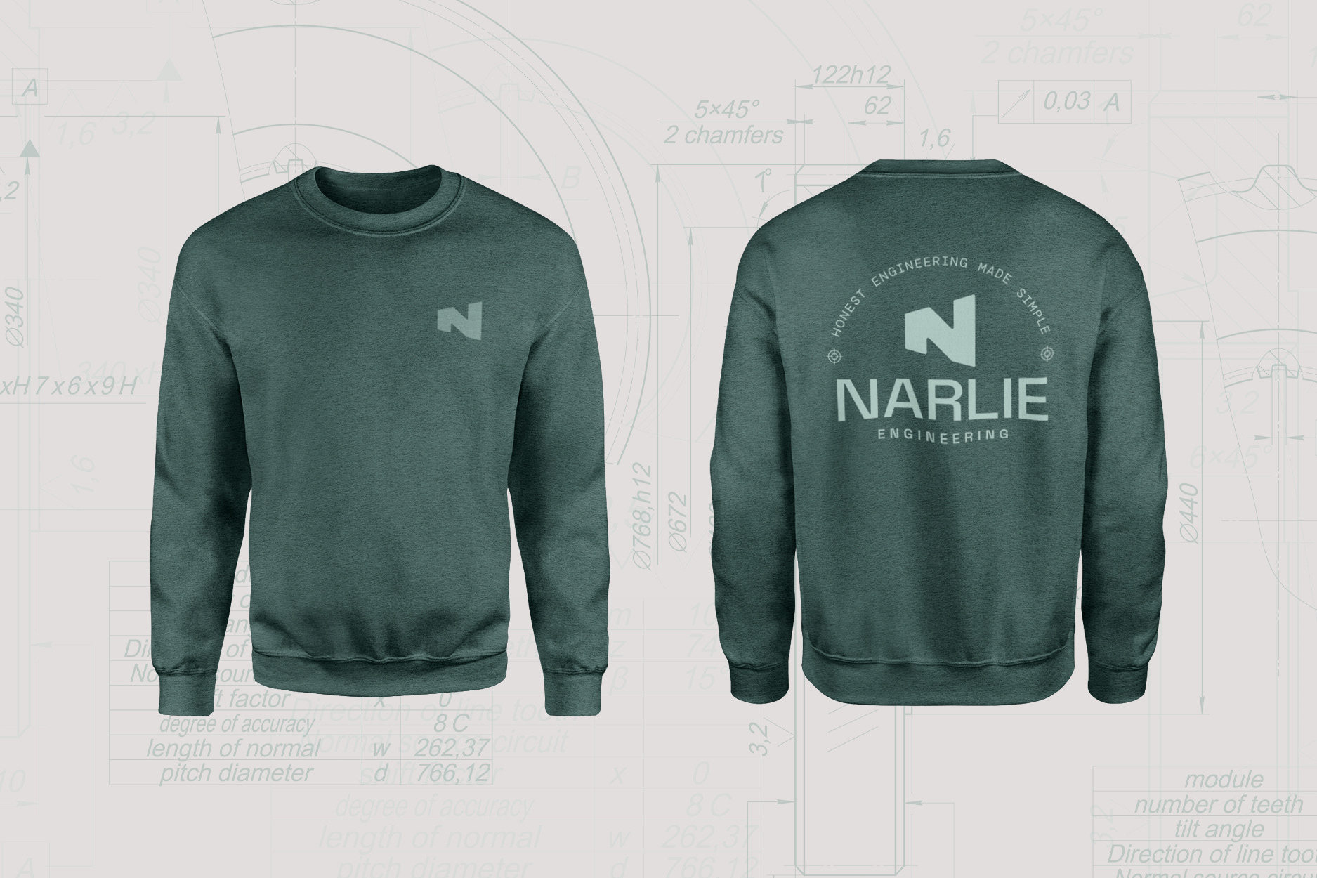
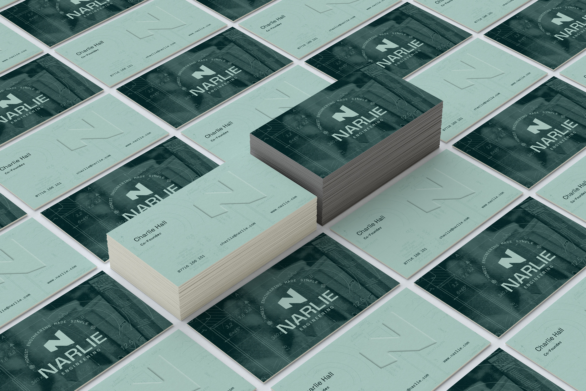
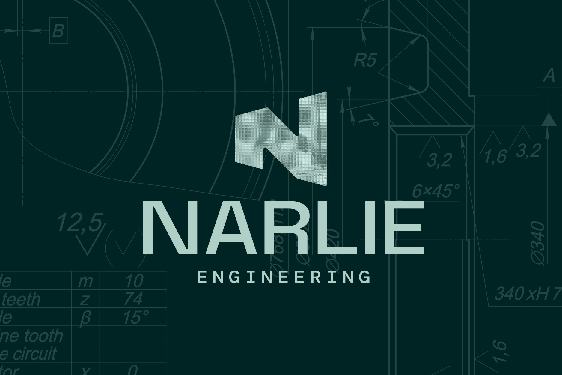
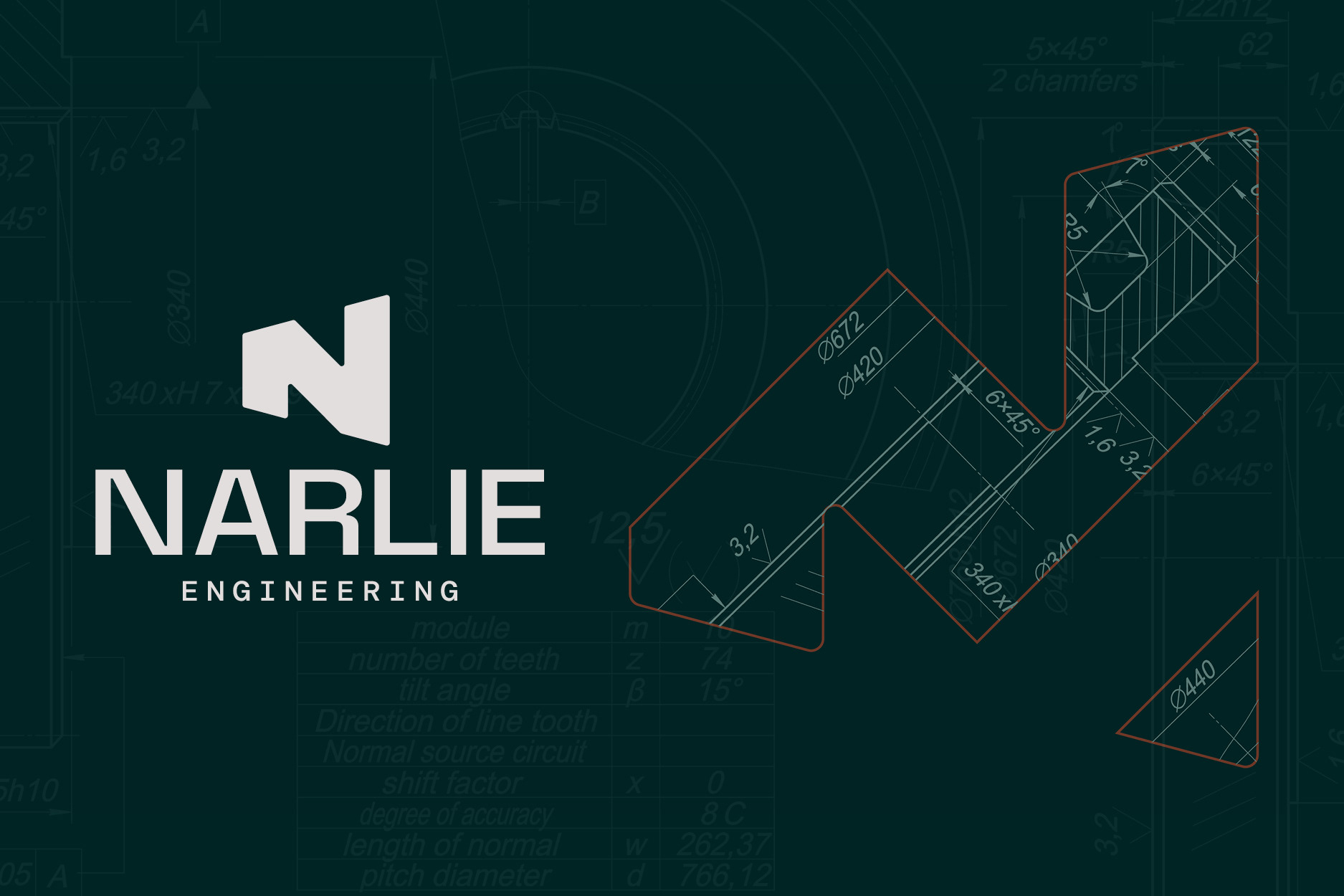
The idea sits in the icon. The Narlie "N" is built from a third-angle projection of a cone, viewed from the side: two vertical faces joined by a diagonal. That's one of the most fundamental shapes in engineering drawing. So the mark doesn't just spell the name. It comes from the same visual language Narlie's own engineers use every day. There's a secondary version too, the full technical projection drawn as it would appear on an engineering sheet, which shows exactly how the primary mark was made.
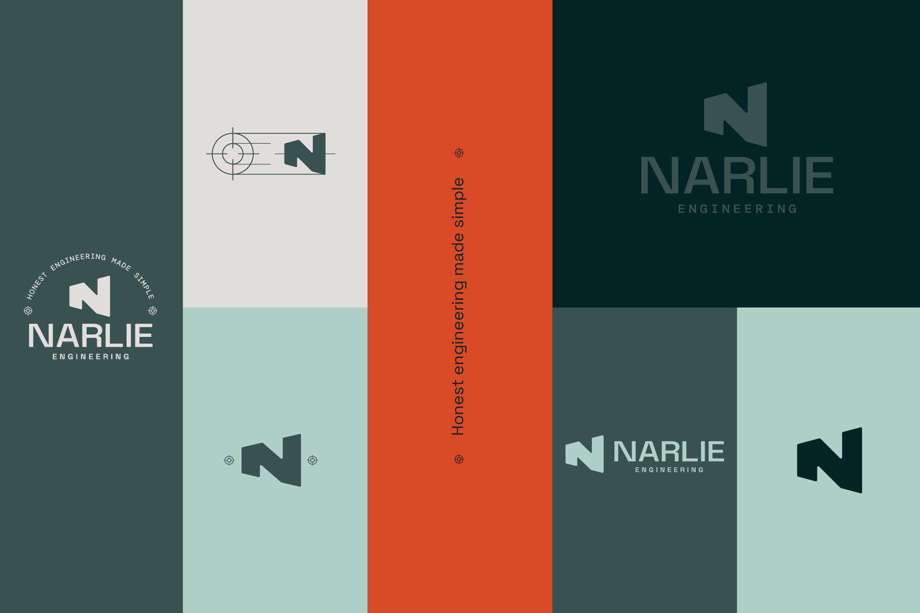
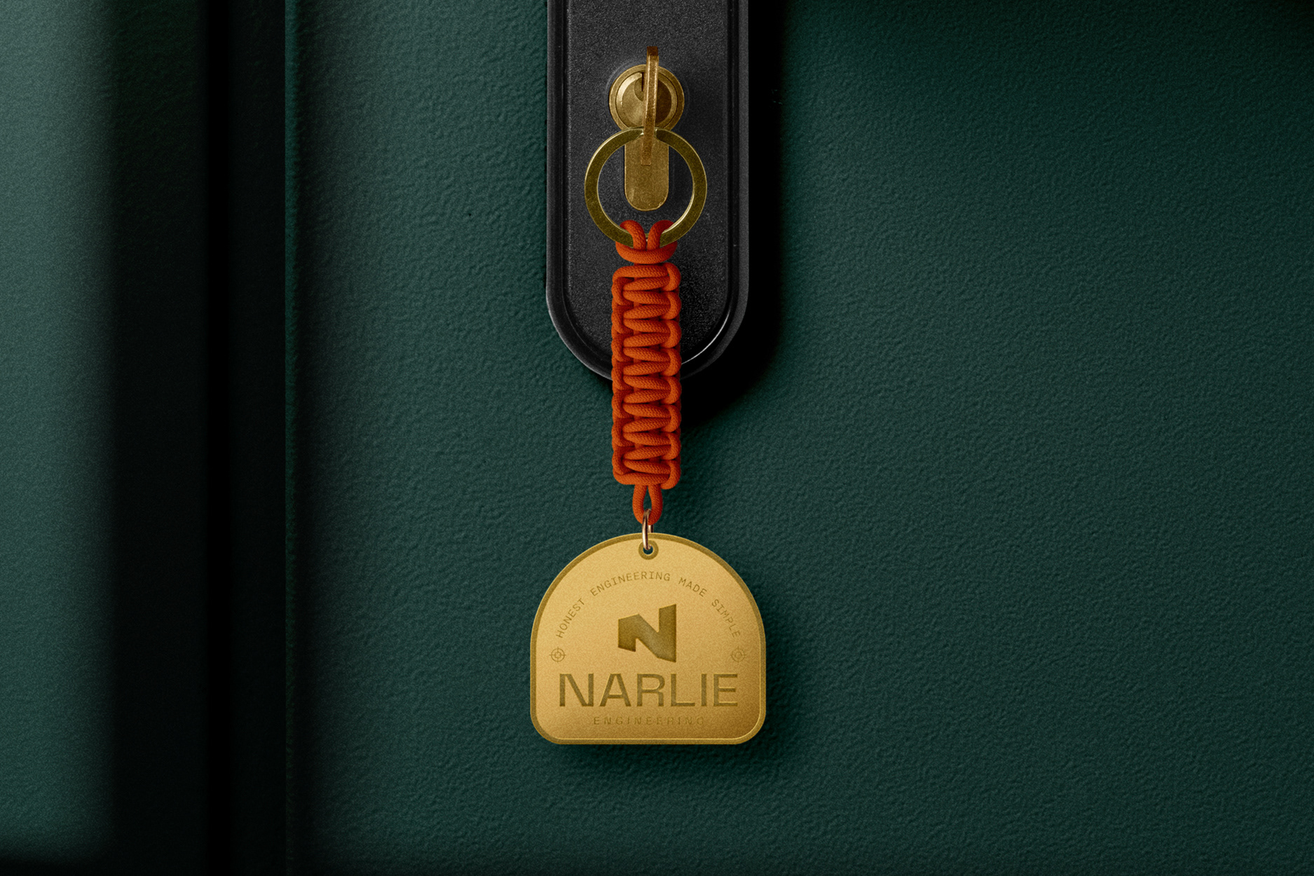
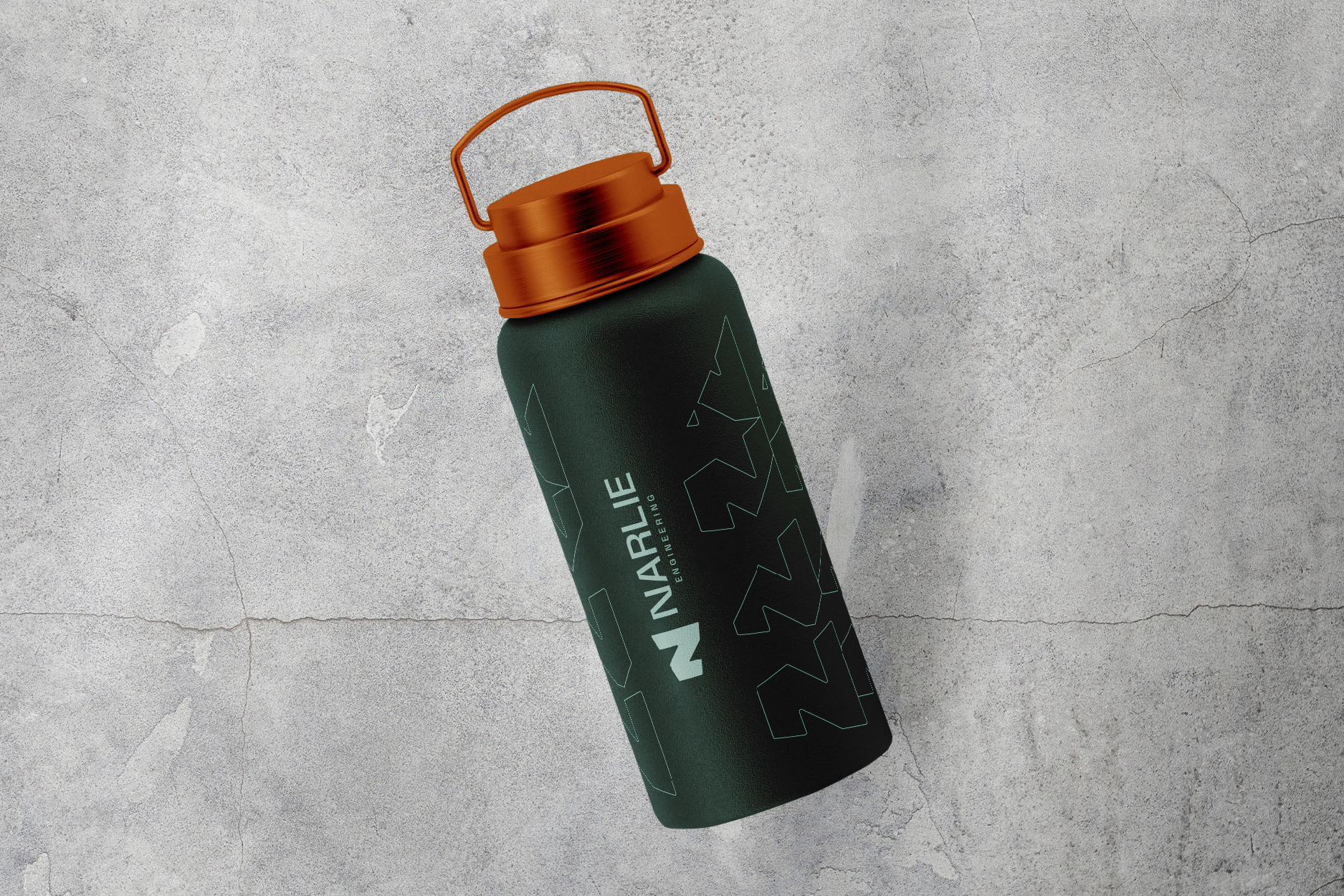
Around that I built a complete system. Space Grotesk for headings, clean and functional with a little edge. DM Mono for section headings, monospaced so it reads as engineered and precise. DM Sans for body copy, the warmer, more human part of the family. The palette runs on a deep Slate base with Flint and Mint, kept calm and considered, with a single Ember orange used sparingly when something needs to lift.
The result is a brand that works the way Narlie does. Structured, grounded and quietly assured, with the engineering thinking built into the mark itself rather than bolted on afterwards. The full identity is documented in a 63-page set of guidelines, from strategy and tone of voice through to every application.