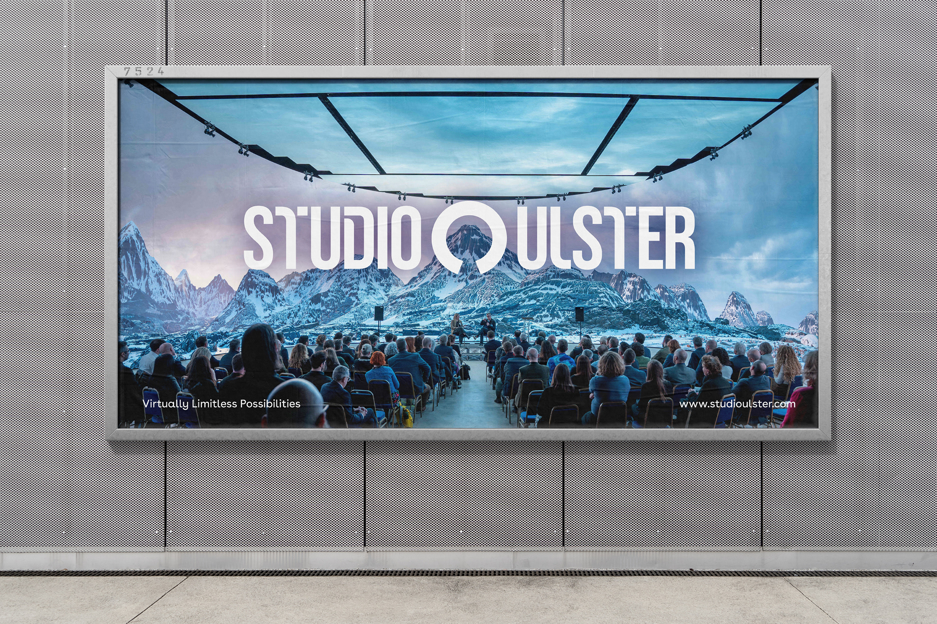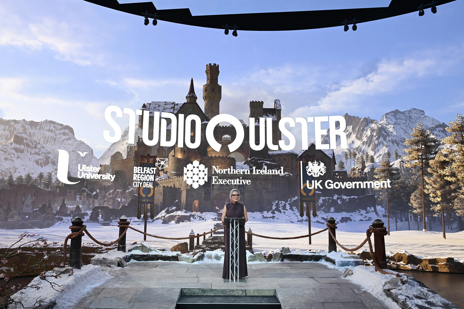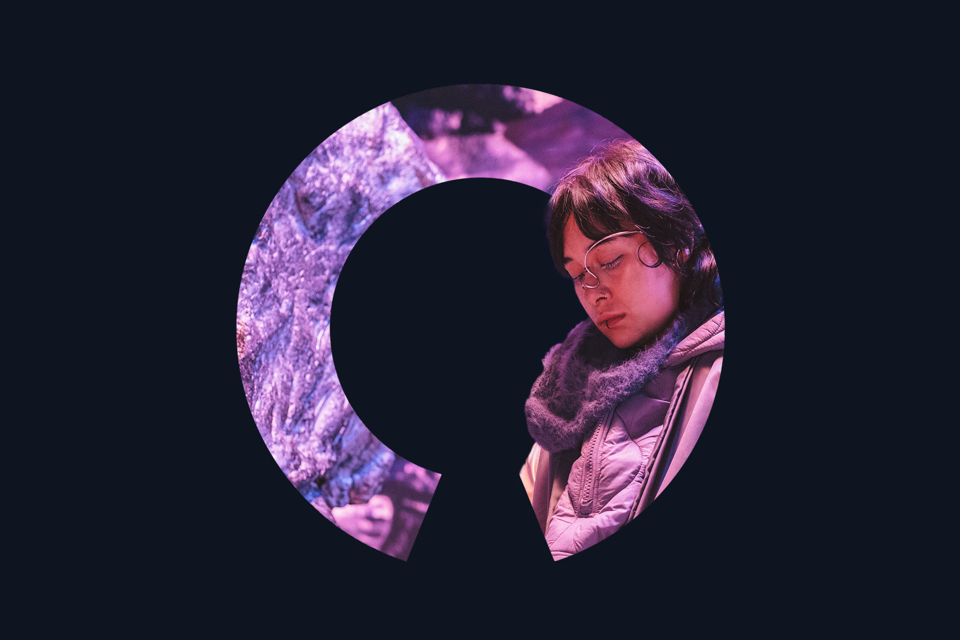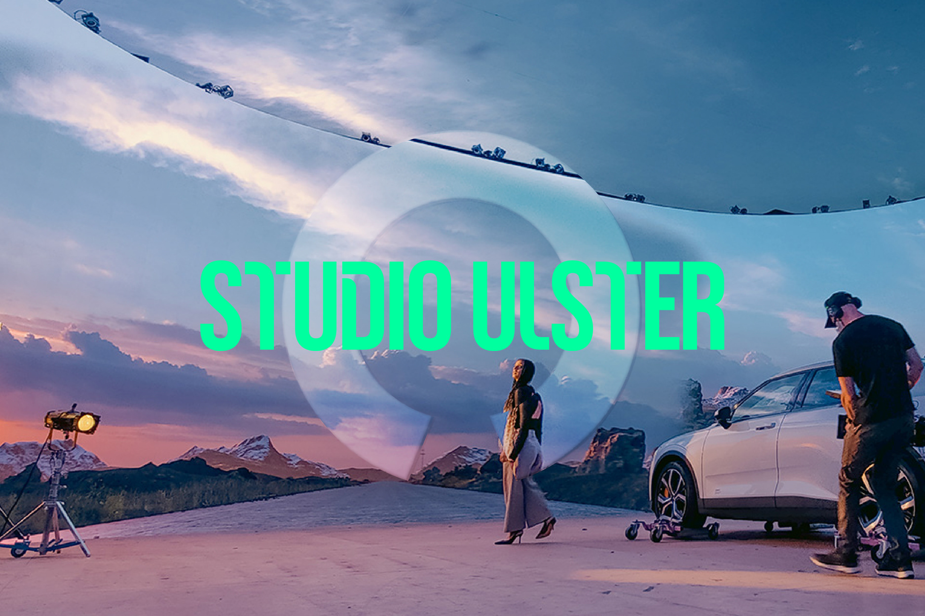
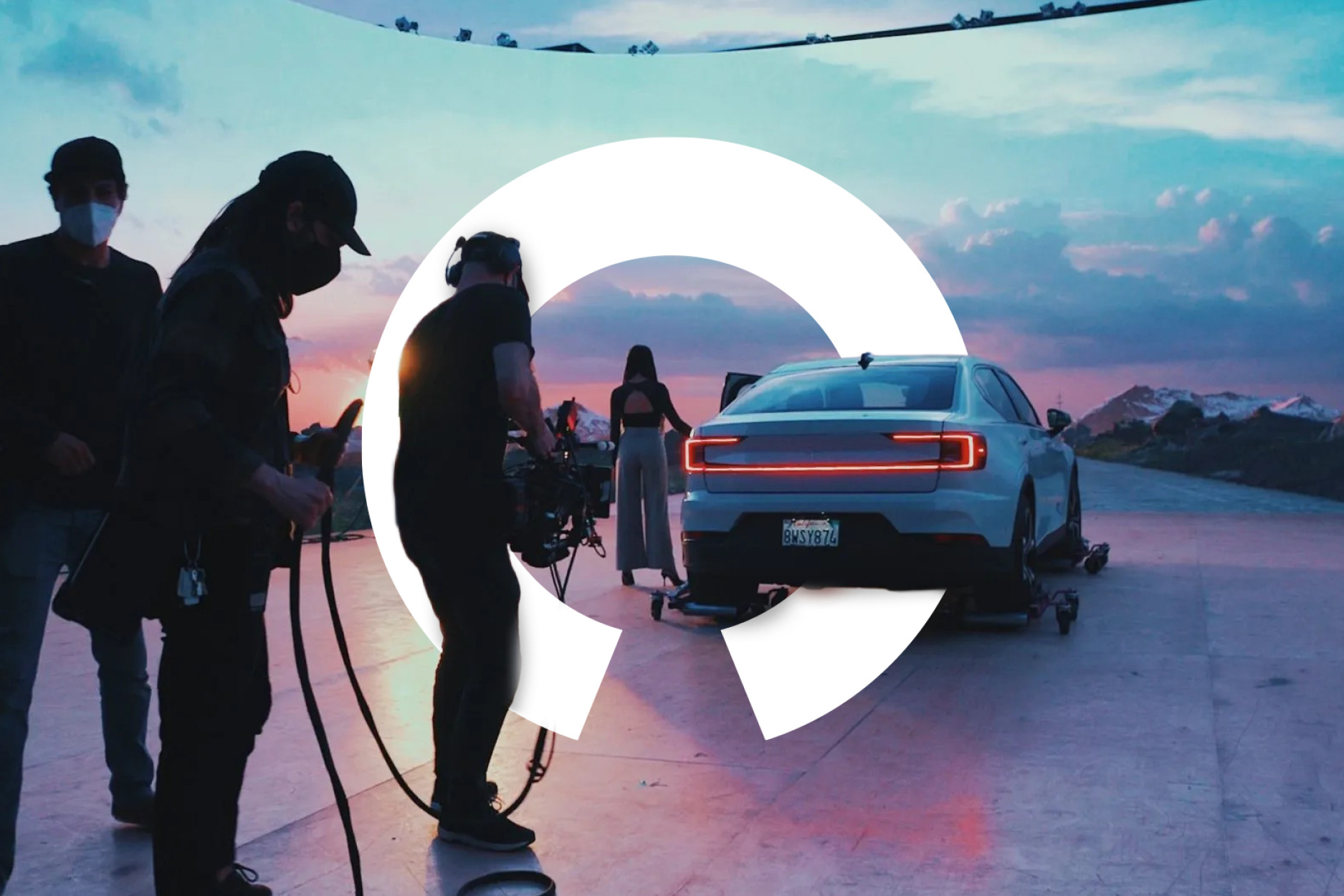
The starting point was already there. Studio Ulster's symbol is a circle, and that circle means something specific: it's the shape of the wrap-around screen the studio is built on, the surface that creates the virtual world. So rather than replace it, I built the new identity around it.
The circle became an aperture. A way of framing whatever sits inside it, whether that's a snow-capped mountain range on the LED volume, a crew member on set, or the studio's own work. It reads as a lens and as a window at the same time, which is exactly what the studio does for the brands that film there.
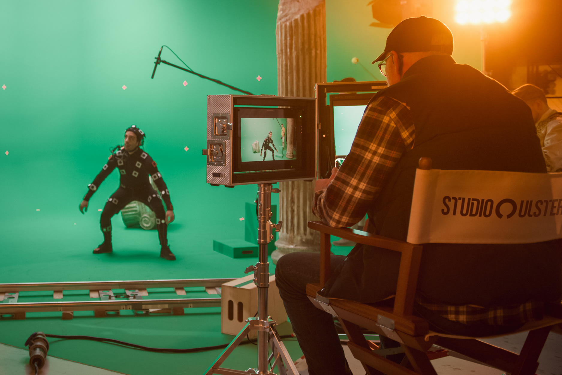
From there I designed a modern custom logotype, a new colour palette, and a more flexible set of ways to use the brand across screen, set and print. Once the identity was signed off, the Freuds design team used it to produce the wider rollout, from the launch event backdrop to out-of-home.
The brand now holds its own next to the technology it represents, and stands up alongside the partners behind the project, including Ulster University, the Northern Ireland Executive and the UK Government.